Archived article
Please note that tax, investment, pension and ISA rules can change and the information and any views contained in this article may now be inaccurate.
 magazine
How to use the X-Ray tool to keep your investments on track

Staying on top of your investments is important if you want to make a success out of putting your money to work in the financial markets.
A useful tool, created for this purpose, is the Morningstar Portfolio X-Ray which is available to AJ Bell customers.
It’s particularly helpful in determining if you have the appropriate mix of investments. Diversification is about spreading your investments into assets which have different risk and return profiles and, by doing so, smoothing your portfolio returns.
X-RAY SHOULD REFLECT YOUR RISK APPETITE
The proportion of your portfolio allocated to distinct asset classes will depend on your investment profile and risk appetite. To maintain these proportions, you will need to manage your portfolio actively through a process known as rebalancing.
For example, if you have a portfolio with 60% stocks and 40% bonds, and the stocks perform well while the bonds’ returns decrease, the value of your holdings may change to 70% stocks and 30% bonds. Rebalancing involves selling some of the stocks which have appreciated in value and purchasing more bonds until the portfolio returns to its original allocation of 60% stocks and 40% bonds.
This practice can help maintain a consistent level of risk exposure and promotes the discipline of selling assets which have appreciated in value and buying those that may be relatively undervalued. This is not necessarily something you would want to do too regularly as it obviously there are costs to trading investments but doing so on an annual basis is a sensible rule of thumb for most people.
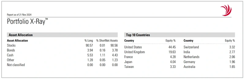
The first section of the X-Ray is particularly helpful in this regard as it shows the balance of your portfolio between stocks, bonds and cash as well as ‘other’ and ‘not classified’ categories. In the example shown, stocks make up the vast majority of the portfolio – suggesting a pretty high tolerance for risk.
You can also see a geographic breakdown, in this case the US accounts for a large proportion of the portfolio, although lower than MSCI All-Country World Index where it has a rough two-thirds weighting.
BREAKING DOWN INVESTMENTS BY TYPE
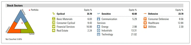
The X-Ray tool also analyses the underlying stocks within the portfolio, categorising them as Cyclical, Sensitive, or Defensive based on their correlation to the business cycle. Cyclical stocks, like housebuilders, are highly sensitive to the economy, while Defensive stocks, such as utilities, are not. Sensitive stocks, such as industrial companies, fall in between.
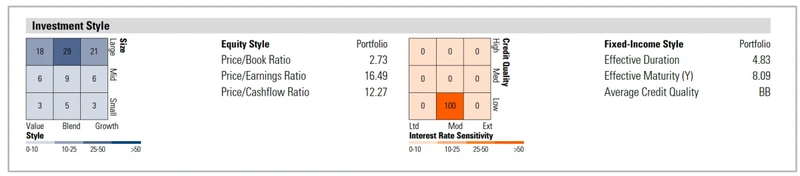
Additionally, you get insight into your exposure to different investment styles. Diversifying across investment styles (value, growth, size) can help manage risk and reduce volatility, as different styles perform better at different times in the economic cycle. The information includes valuation metrics for the stocks and shares component of the portfolio and, for the bonds, details of how long they have until they mature and the average level of creditworthiness.
The report shows your performance in absolute terms and compared to a benchmark. The ‘+/- Benchmark’ indicates how much you have outperformed or underperformed, not the benchmark’s actual performance. If you are drastically underperforming the benchmark, particularly if the underperformance has been over an extended time period, it is worth taking a closer look at your investments and trying to work what might be going wrong.
MORE COMPLICATED STUFF
Some sections of the X-Ray tool are slightly more complicated although they can still be useful. The finance industry uses standard deviation to measure risk, indicating how much your portfolio’s value fluctuates. If your portfolio consistently delivers 5% annually without variation, its standard deviation would be zero. In this case, lower deviation signifies less risk.
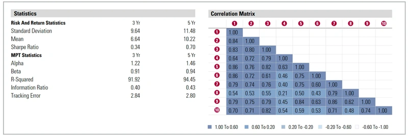
The Sharpe ratio incorporates the standard deviation to compare the returns on offer from an investment with the level of risk. The higher the figure the better and any value greater than one is considered good. Two is very good and three is excellent.
Another item is the correlation matrix. If you think of the shares and funds in your portfolio as magnets, attracting or repelling others, the correlation matrix measures this attraction. Positively correlated shares move together, while negatively correlated ones move oppositely. The numbers indicate the strength of correlation between asset pairs. A +1.0 means perfect synchronisation in the same direction, -1.0 means opposite directions, and zero means no relationship.
DISCLAIMER: AJ Bell referenced in this article owns Shares magazine. The author (Tom Sieber) and editor (Ian Conway) of this article own shares in AJ Bell.

Important information:
These articles are provided by Shares magazine which is published by AJ Bell Media, a part of AJ Bell. Shares is not written by AJ Bell.
Shares is provided for your general information and use and is not a personal recommendation to invest. It is not intended to be relied upon by you in making or not making any investment decisions. The investments referred to in these articles will not be suitable for all investors. If in doubt please seek appropriate independent financial advice.
Investors acting on the information in these articles do so at their own risk and AJ Bell Media and its staff do not accept liability for losses suffered by investors as a result of their investment decisions.
Issue contents
Great Ideas
News
- On The Beach shares hit 52-week high in January
- Investors see green shoots of life in a moribund new listings market
- Poolbeg Pharma shares go into freefall after merger talks with US biotech firm revealed
- Investors sour on alcohol stocks after US surgeon general calls for cancer warning labels
- Next bucks weak retail trend while Tesco and Sainsburys celebrate blow-out Christmas sales